Figure 3
Download original image
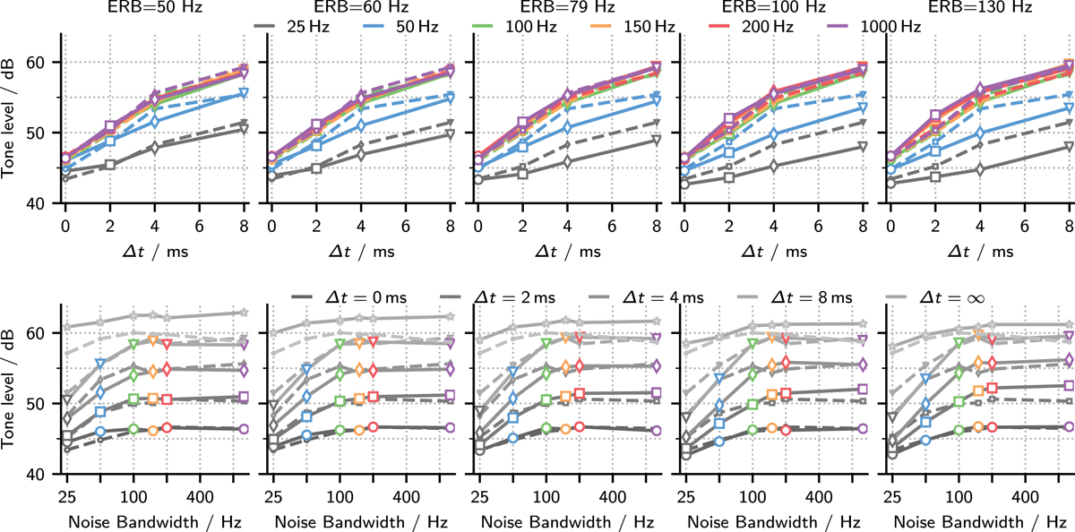
Model predictions (solid lines with symbols) and experimental data (dashed lines). The five columns show predictions obtained with five different filter bandwidths. In the top row, thresholds are plotted as in Figure 1. In the bottom row, the same data are plotted as a function of noise bandwidth with different lines representing the different noise ITDs. The symbol color is kept from the bandwidth color-coding in the top row. Data for uncorrelated noise maskers is only shown in the bottom panels in light gray. No error bars are shown for the simulations, because the standard error of the mean was <0.5 dB for all conditions.
Current usage metrics show cumulative count of Article Views (full-text article views including HTML views, PDF and ePub downloads, according to the available data) and Abstracts Views on Vision4Press platform.
Data correspond to usage on the plateform after 2015. The current usage metrics is available 48-96 hours after online publication and is updated daily on week days.
Initial download of the metrics may take a while.