Figure 1
Download original image
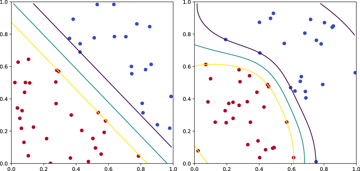
Theoretical example of a SVM in the square [0, 1]2 obtained with scikit-learn. The left panel is linear, the right panel is radial. The labels are represented by different colours, red and blue. The cyan curve represents the separation between regions associated to different labels. The yellow and purple curves represent the limits of the specified margins around the boundary.
Current usage metrics show cumulative count of Article Views (full-text article views including HTML views, PDF and ePub downloads, according to the available data) and Abstracts Views on Vision4Press platform.
Data correspond to usage on the plateform after 2015. The current usage metrics is available 48-96 hours after online publication and is updated daily on week days.
Initial download of the metrics may take a while.