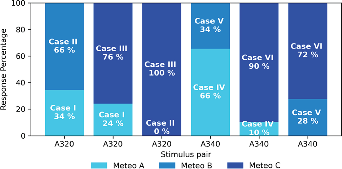
Figure 8.
Download original image
Stacked bar chart of relative responses from participants in the second stage of the experiment. Lower segments represent the percentage of responses in which the stimulus with lower atmospheric turbulence was judged more annoying. Upper segments correspond to responses in which the stimulus with higher atmospheric turbulence was judged more annoying. Colors indicate the meteorological conditions A, B, and C as defined in Table 1. Each stimulus pair received 29 ratings.
Current usage metrics show cumulative count of Article Views (full-text article views including HTML views, PDF and ePub downloads, according to the available data) and Abstracts Views on Vision4Press platform.
Data correspond to usage on the plateform after 2015. The current usage metrics is available 48-96 hours after online publication and is updated daily on week days.
Initial download of the metrics may take a while.